Messenger
A mobile messaging application seeking to empower community through instant messaging, photo and video sharing, and group chats.
Role
UX/UI Designer
Duration
November 23-30, 2020 (1 Week)
Problem
It’s now easier than ever to communicate with someone online. However, while using the Facebook Messenger app, I noticed a critical problem in the location of message requests and important messages. Message requests are hidden from the user while meaningful conversations are often pushed down to the bottom of the list, preventing users from seeing messages from people who are not friends and people who are friends.
Goal
Since Facebook Messenger has become a major center of communication, I redesigned the Messenger app to better facilitate contact between others, particularly between new people and people we care about. Rather than encouraging the lost of new and important connections, I wanted to improve the accessibility of Messenger’s chat functions, allowing everyone to form new relationships while strengthening old ones.
“How might we make message requests and important conversations more visible so people can easily navigate and access Facebook Messenger’s features?”
Research & User Interviews
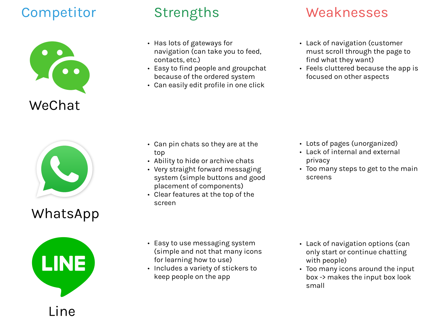
Before creating a solution, I researched and compared Facebook Messenger to direct competitors such as WhatsApp and WeChat to develop a better understanding of useful chat features and functions. I complied a list of the different features each app had and identified the advantages and disadvantages of each feature. I kept each of these problems in mind when creating the prototype.
Insights
After studying the existing application and conducting interviews and extensive research, I noticed a common desire and pattern among users: that users are more likely to use the Messenger app more often if different chats were all accessible in one place.
Creating a clear navigation system is critical for the accessibility of message requests and chats
Addition of a favorite feature makes users more inclined to respond to conversations, preventing the lost of important messages from friends
Organization of chats and stories is vital to the user’s desire to interact with others
Userflow
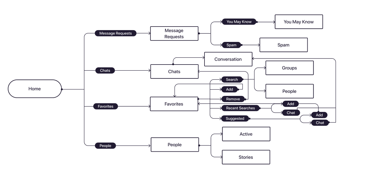
To get a better idea of the final product, I created a basic user flow to demonstrates the steps users must take to go from screen to screen.
Wireframes
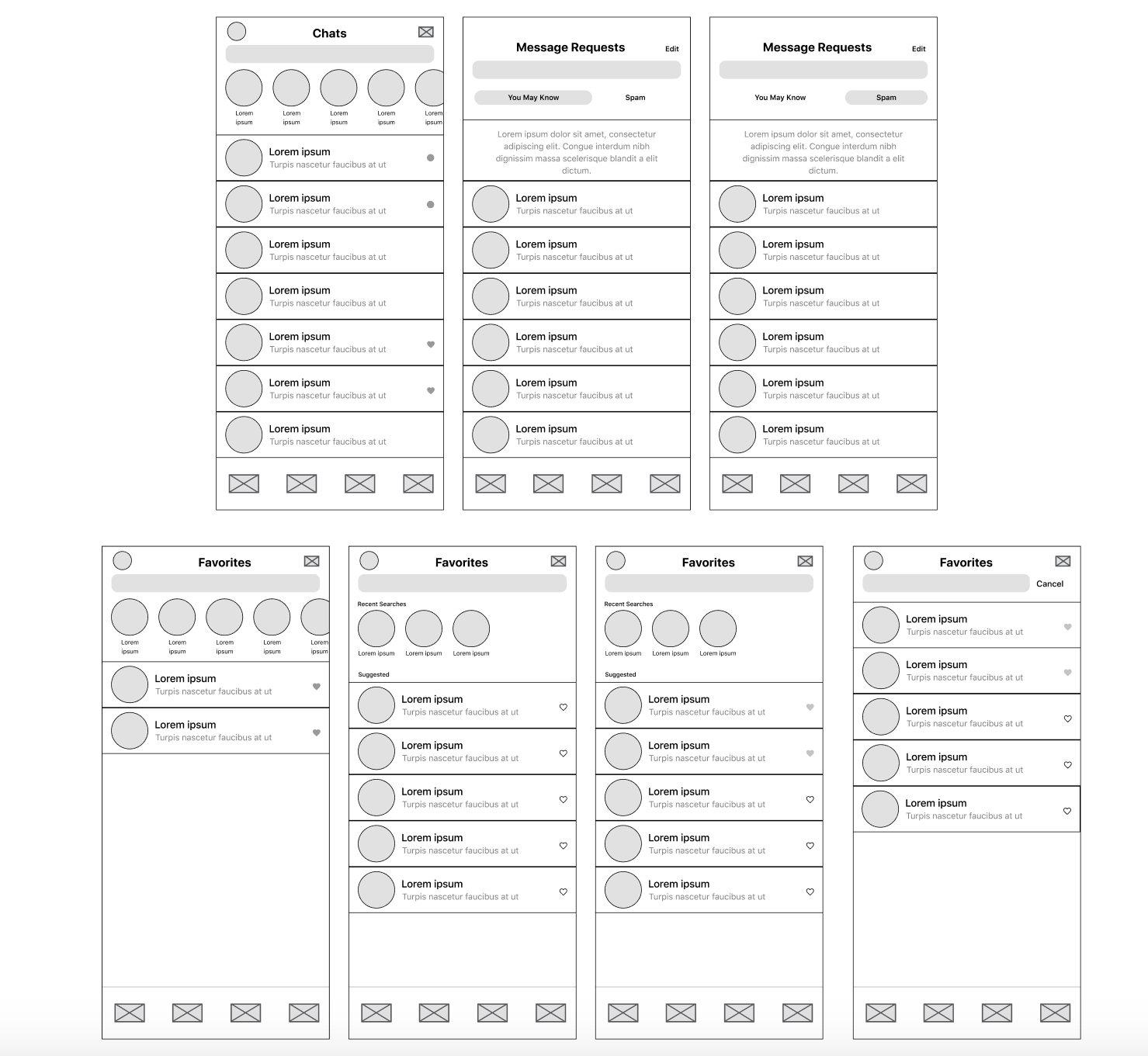
After constructing the user flow, I started on making low fidelity wireframes that would help me visualize the changes in navigation and features.
Solutions
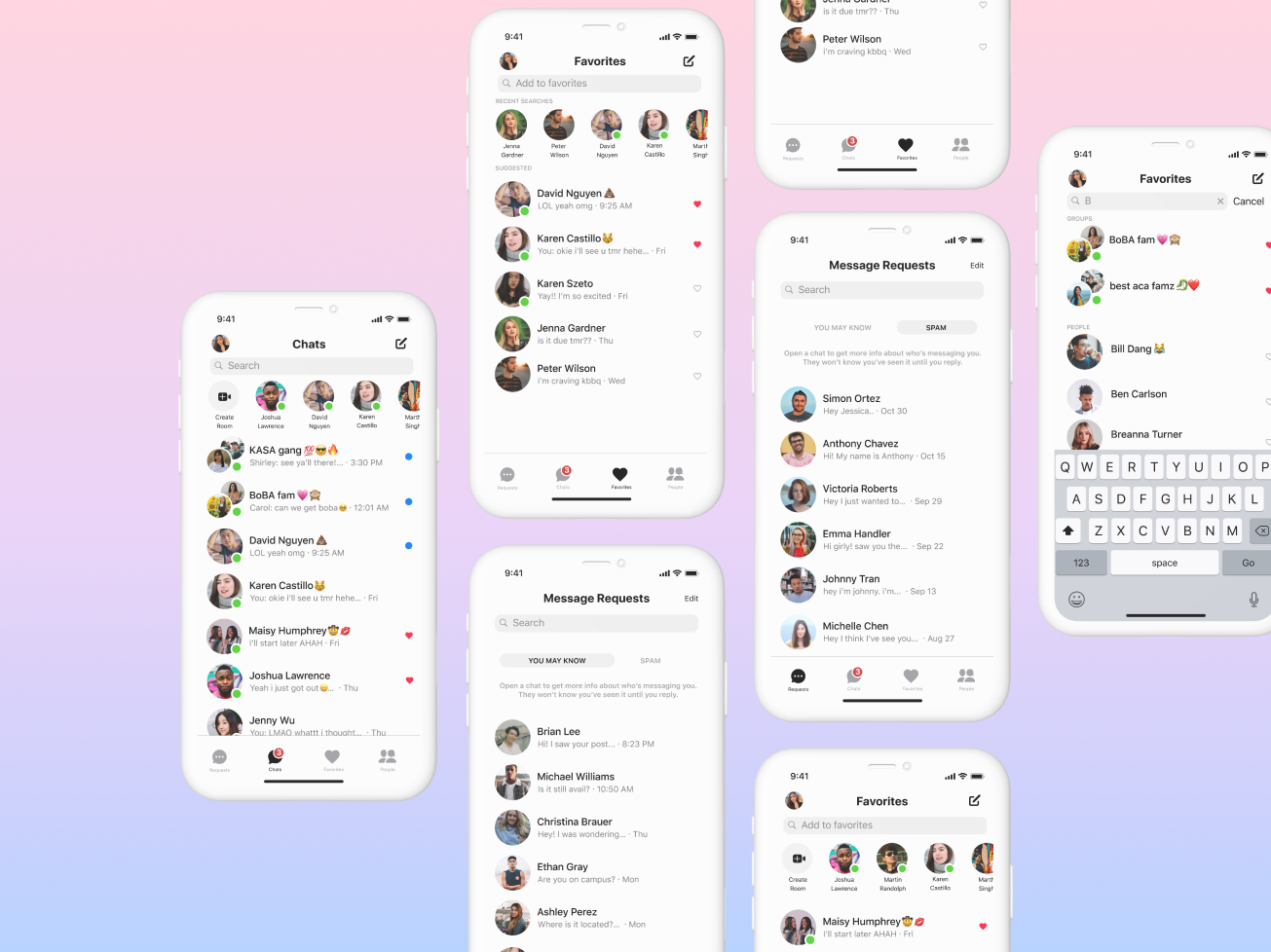
Through this process, I was able to successfully redesign the Facebook Messenger app with improved accessibility and organization. Below, view the solution.
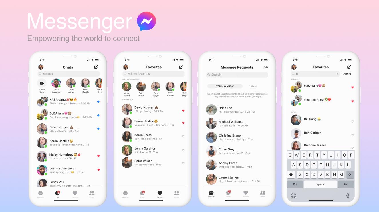
Chats
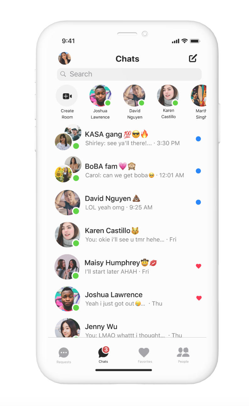
Chats:
View all your chats in one place, with unread messages and favorited conversation at the top of the list
Navigation:
Simply click on the icons on the bottom bar to locate message requests, chats, favorited chats, and people
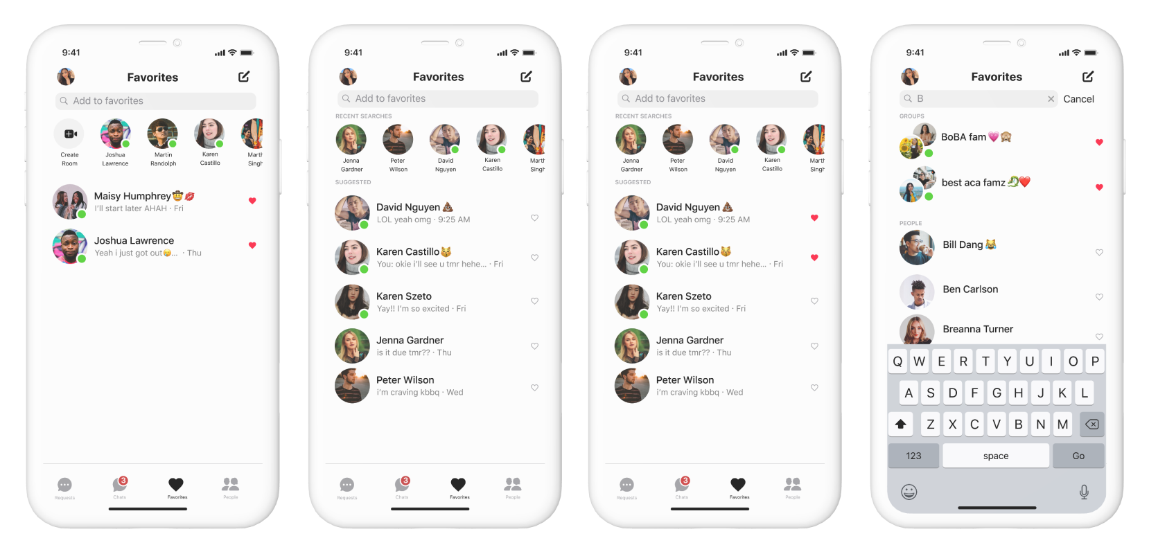
Favorites
Hearts:
See and chat with your favorite conversations in one place
Recent Searches & Suggested:
Add people to your favorites based on recent searches and activity between friends
Add to Favorites:
Want to add someone to your favorites? Simple search for groups and friends to add or remove them by clicking the heart icon
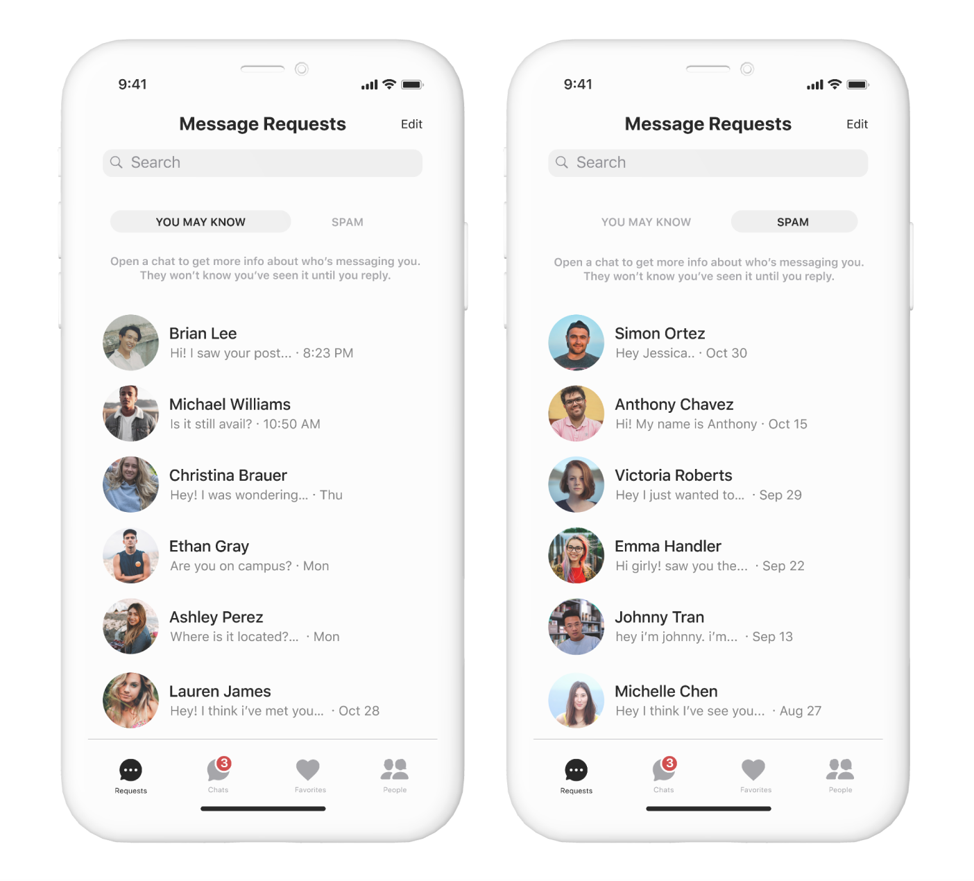
Message Requests
You May Know:
View and respond to messages from people who have mutual friends as you
Spam:
Choose whether to respond to messages from people who you may not know
Takeaways
Fully understand the problem
After completing this redesign, I reflected a lot on my design skills. Whether it’s a tiny change or a complete project, I now seek to understand. It’s crucial to understand the problems at hand to really understand what the users want and need. I learned this particularly when I was conducting a competitive analysis and user interviews, trying to connect the audience’s frustrations to issues in design.
Never rush the design process
Although this redesign was done in in the span of five days, I learned to never rush the design process. Thinking critically and conducting the proper research is far more important than crafting a pretty design under a time restriction. After completing this project, I realized that there were essential steps that could’ve made this design much more usable and accessible such as conducting more research or spending more time on ideation.
Next Steps
Nonetheless, I still learned a lot about myself as a designer, allowing me to truly reflect on my strengths and weaknesses. While these may look like small design changes some, the slight increase in usability can cause a huge impact for users and that’s what I’m love about design. This project not only provided me with valuable learnings, but it also helped me get closer to my true passion in life, the most important lesson.