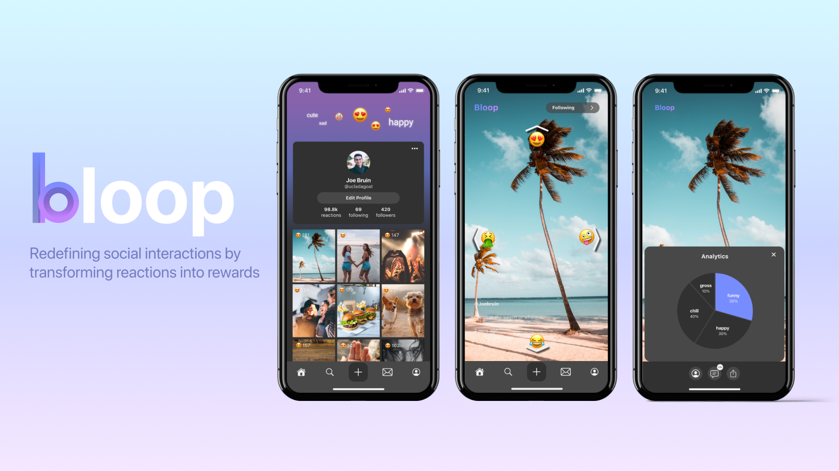
Bloop
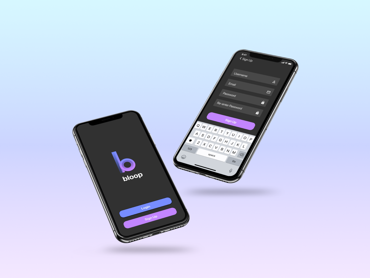
A fun and interactive video sharing application and social network platform that rewards users with more content based on previous interactions.
Team
Project Leads: Adithya Nair, Roshni Rao
Developers: Alex Haddad, Reema Kshetramade, William Herlim
Designers: Katherine Wang, Sandy Li, Lydia Luong, Jessica Xie
Role
UX/UI Designer
Timeline
January - March 2021 (10 Weeks)
Problem
Social media has lost its sense of community. Whether it’s video and photo sharing platforms like Instagram and Tiktok or discussion sections like Twitter and Reddit, we see this theme of mindless scrolling everywhere. Especially with quarantine becoming the new norm, the lack of true social interaction is dramatically disappearing, defeating the original purpose of social media.
Goal
With the prevalence of mindless scrolling becoming increasingly common, our team collaborated to design and develop a mobile application that would end this norm. Rather than continuing this cycle of disconnection, we wanted to reestablish the sense of community and positivity. By placing user-content interactions front and center, Bloop seeks to transform reactions into rewards, redefining how people respond to social media.
“How might we create a fun and interactive platform for people to actively engage in content so they don’t feel the need to mindlessly scroll?”
Research
Competitive Analysis
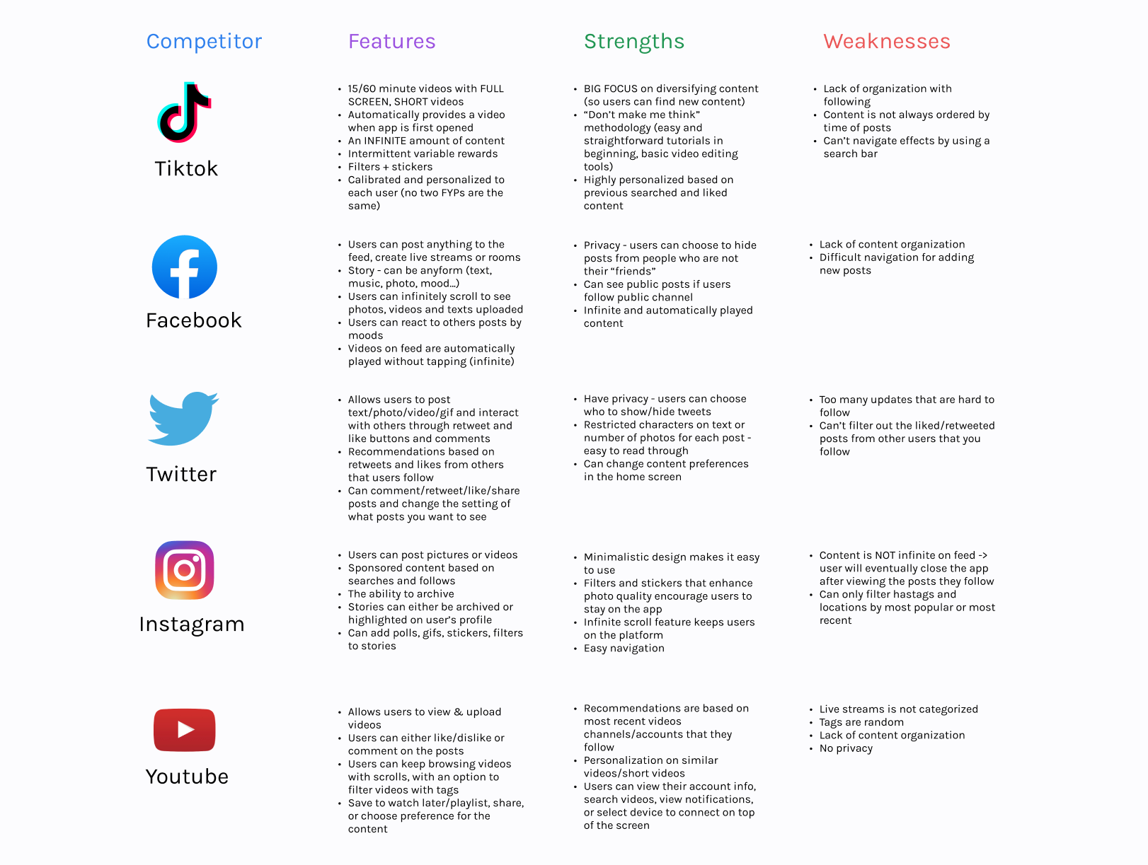
As a team, we researched the direct competitors and analyzed our target audience for this application. We created a list of the different user interactions and features on each social media platform and identified the advantages and disadvantages of each feature. We kept each of these problems in mind when creating our wireframe and prototype.
Insights
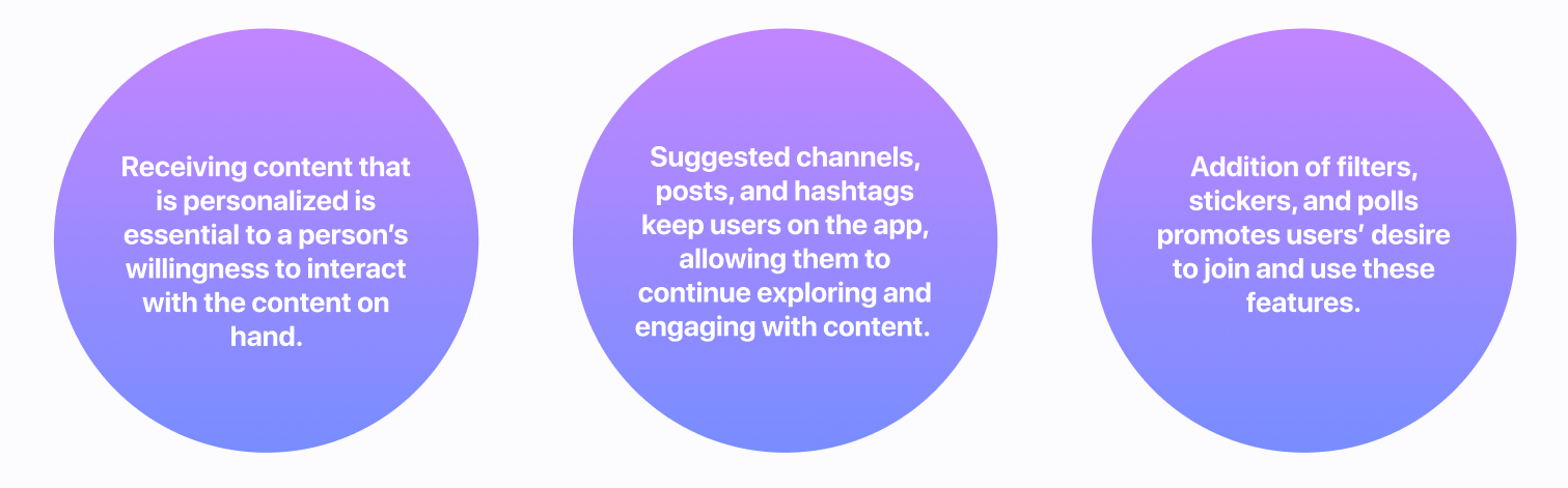
Existing paradigms such as Facebook, Twitter, and Instagram recommend new posts and updates on a daily basis, but content is often scattered and irrelevant.
Ideation
When translating the pain-points into ideas, we wanted to focus on a user centered design, prioritizing personalization and interactive elements into our screens. With the insights in mind, we decided to dedicate the creation of Bloop to fun and direct interactions with the content, allowing users to constantly connect with eachother while receiving accurate recommendations.
Features
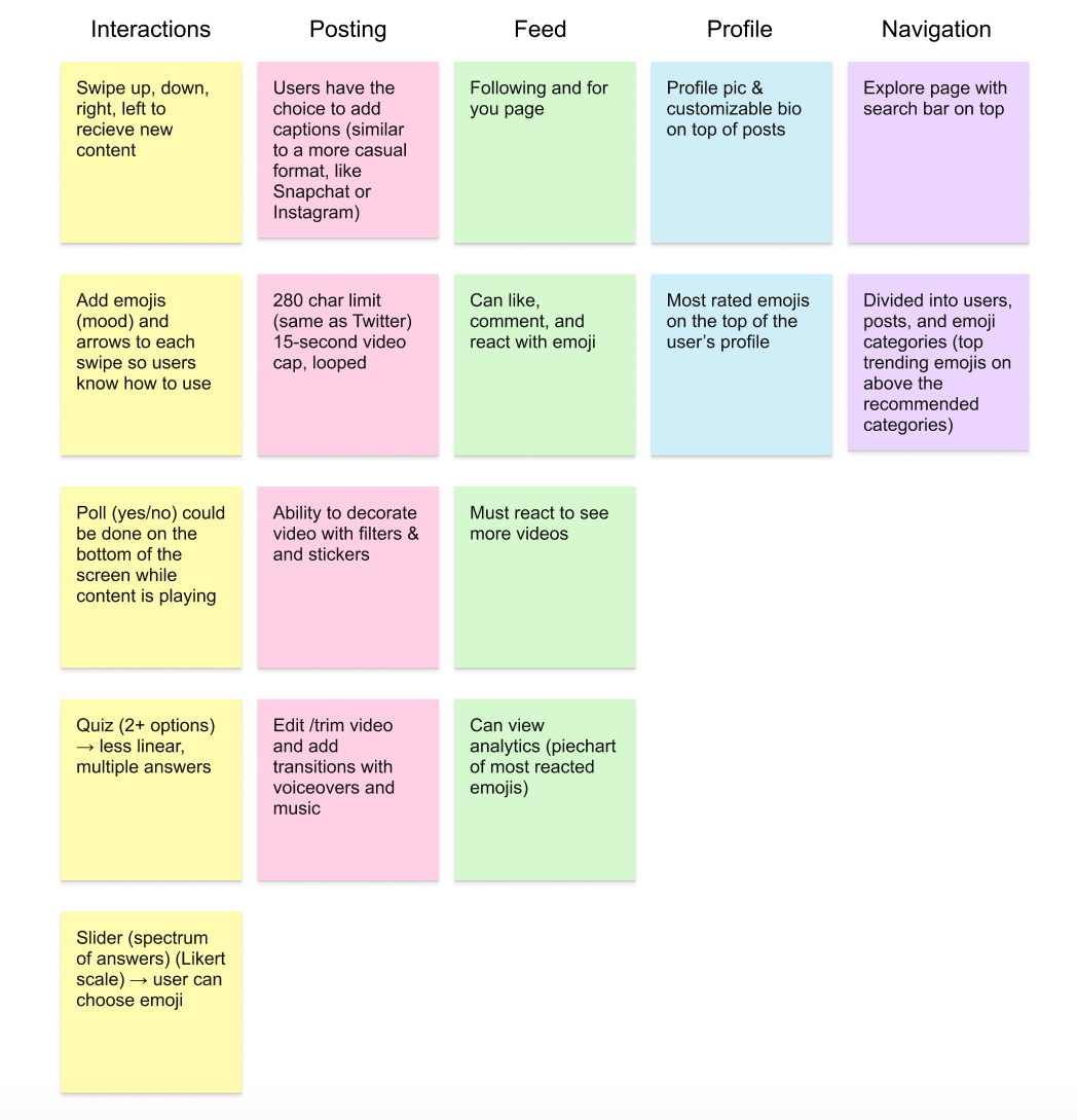
After brainstorming and communicating our ideas with one another, we created a feature prioritization chart to decided on key features that would ultimately end the cycle of mindless scrolling while encouraging users to stay on the app. Ultimately, we decided on focusing on four crucial features for our MVP.
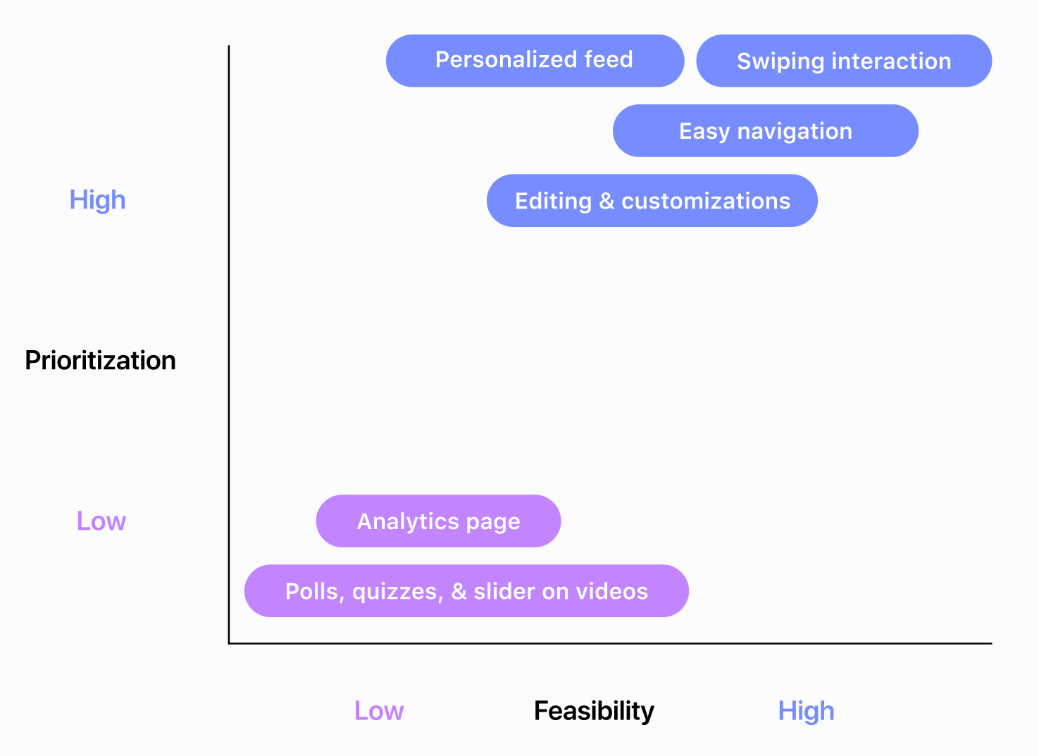
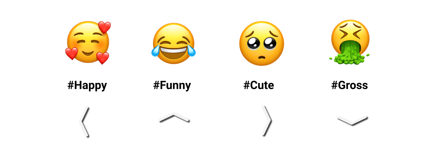
Reactions: Emojis on four sides of the screen where users can swipe on when viewing content
Explore Page: Suggested users and posts featuring easy navigation
For You Page: Personalized content based on user’s top emoji categories
Posting: Editable videos with customizable captions and emoji hashtags
Userflow
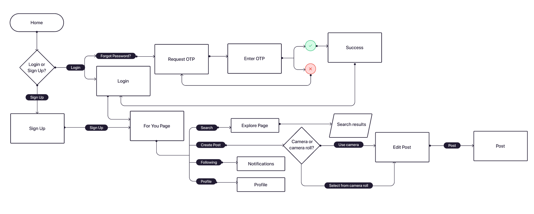
To prepare for the user journey, we constructed a basic user flow that would demonstrate the actions and steps it would take to land on each unique screen.
Wireframes
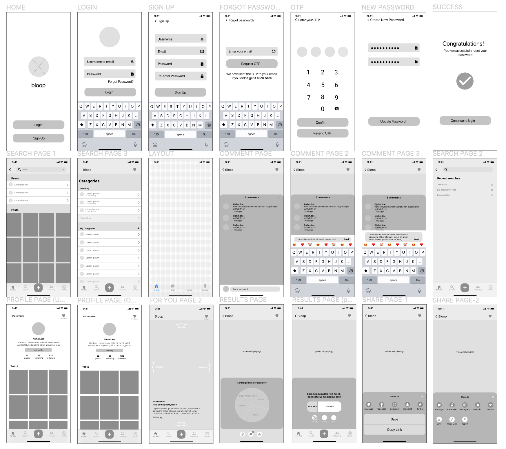
Based on our prioritization grid and research findings, we designed low-fidelity wireframes to organize content and components. From there, we conducted consistent concept reviews throughout the weeks to inform our product managers and developers about updates and compromises.
Design System
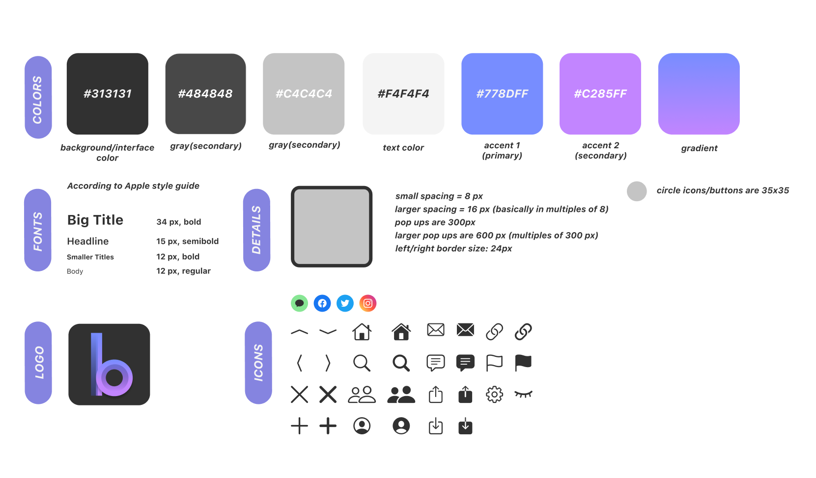
Using calming and creative colors helped convey the feeling of interaction to our users in Bloop. Since shades of blue and purple are associated with comfort and expression, it paired well with our desire to increase engagement on our app. The main typeface would be SF Pro Display. We wanted to select a sans-serif typeface that would balance the rounded edges within our interface, as well as the black/white contrast inside of the app.
Solutions
Through our process, we were able to come up with a create a complete prototype that offered users both a sense of community and entertainment for demo day. Below, view the solution.
For You Page
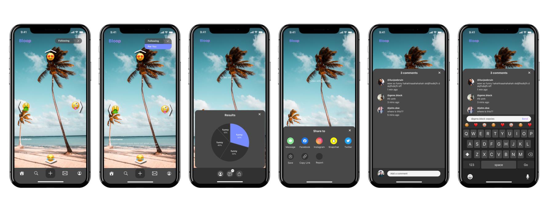
Personalized Content & Following Page:
See posts based on your top reacted emojis and from the people you’re following separated into two separate tabs
Analyze Reactions:
Want to see percentages of frequently swiped emojis? Click on “Results” and you’ll see updated pie chart of reactions from viewers
Like, Share, Comment On, and Follow Creators:
Easily react, share, comment, and follow creators with a click of a button
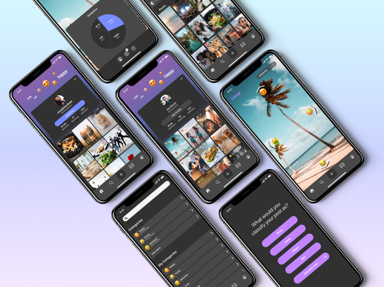
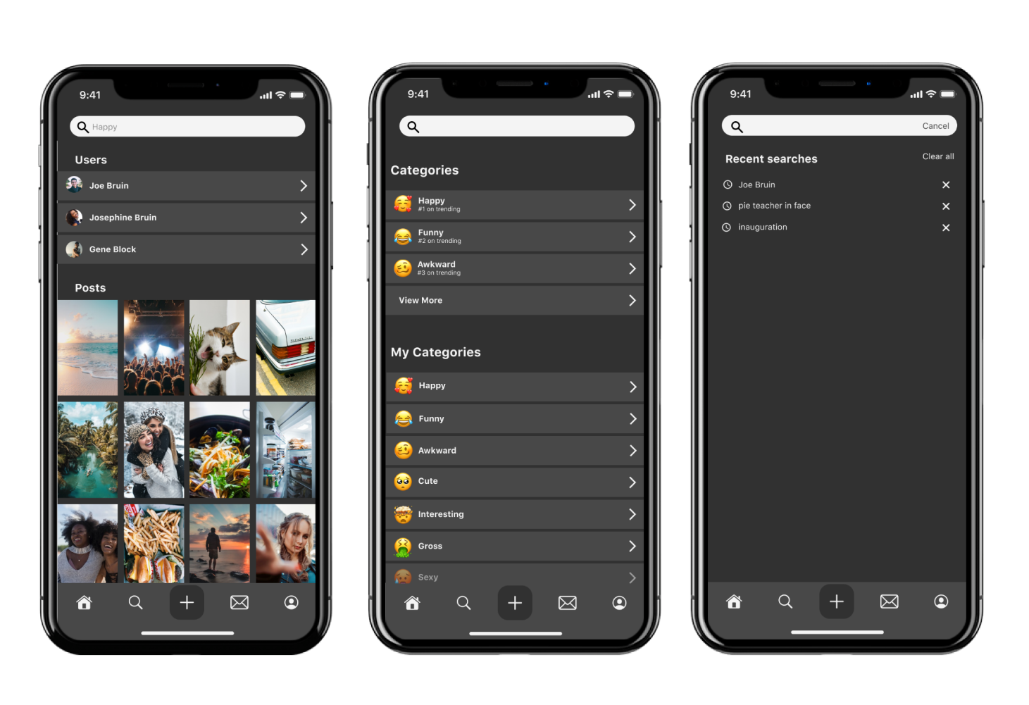
Search Users, Categories, or Posts
Categories:
Click on a category (i.e. Happy) to find curated content
Filter Feature:
Filter by categories, users, or posts
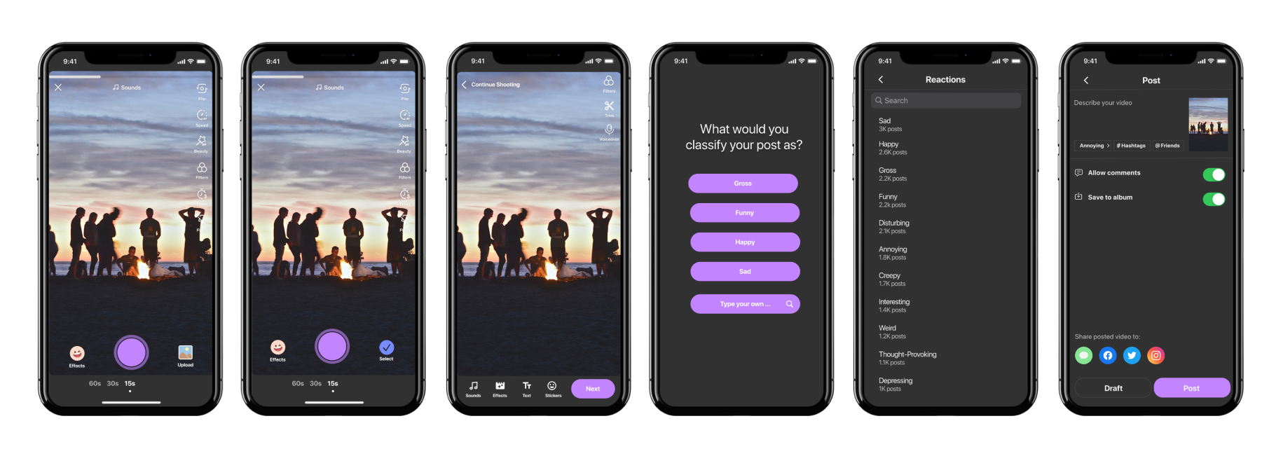
Create and Classify a New Post
Create Post:
Create and edit your newest post with filters and effects so friends can follow your latest updates
Classify Post:
Classify your newest post with the appropriate emoji so people can easily find your content
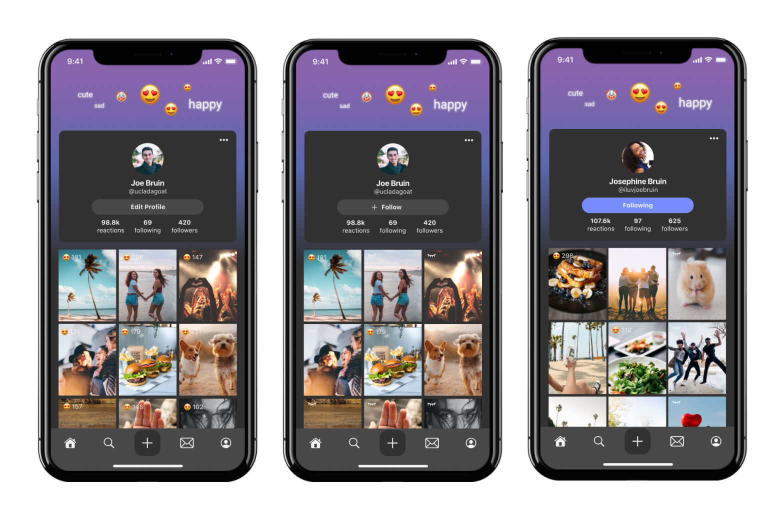
User Profiles
My Profile:
Upload a picture, write a bio, and view your posts all in one place with top reacted emojis on the top corner
Others’ Profile:
View other people’s posts with top emojis based on your own interactions
Takeaways
Challenge yourself with new ideas
Since this application was my first team project, it was a huge learning learning experience for me. Not only did I gain monumental experiences, but I had the amazing opportunity to work with talented project leads, developers, and designers. Coming into this project, I was unaware of the importance of open mindedness during the ideation phase. However, after brainstorming ideas and listening to the feedback of my team members, I learned to really challenge myself with new ideas. It’s extremely important to be open to ideas in a team setting so being receptive really allowed our team to find the best solution for our problem. In addition, I learned to clearly communicate design decisions to our team members, ensuring that everyone is on the same page and satisfied with our design.
Constantly communicate with your team
Although our team meetings were primarily held on Zoom, I learned to not let the physical distance affect our communication, making constant efforts to share our thoughts while scheduling regular team meetings. But most importantly, I learned that I love working with a team. From communicating our ideas to each other to picking the pictures and videos we wanted to use for demo day, it was incredibly rewarding to see our vision come to life. I’m incredibly proud of our team and I can’t wait to launch Bloop in the App Store. I will forever cherish these learnings and continue carrying them into the future.
Next Steps
If I had more time during this project I would’ve conducted user interviews about people’s feelings on using popular social networking apps. As for next steps, I will continue to further explore the connection between reactions and rewards as I dive deeper with my team on this project. Additionally, we’ll work on improving it’s algorithm to test with users so it can eventually be launched in the app store!